What Is a Responsive Website?

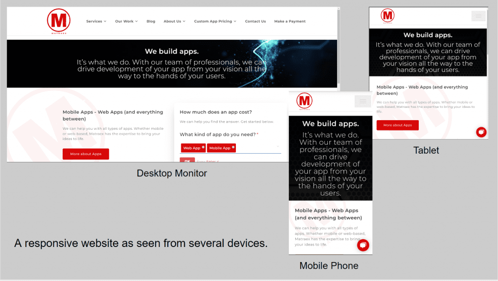
A responsive website is a website that is designed to respond to the user’s behavior and environment based on the screen size, platform (desktop monitor, tablet, phone and so on), and orientation (whether portrait or landscape) of the device they are using. A responsive website uses fluid, proportion-based grids and flexible images to create a dynamic, flexible website that provides a great user experience that looks great on any device.
Questions that will in answered in this article include the following”
- Why is it important to have a responsive website?
- What are the negative consequences of not having a responsive business website?
- What are some common misconceptions about responsive websites?
- How can I tell if my website is responsive?
- If I am using a website builder, do I need to worry about my website being responsive?
- How do I make my website responsive?
Why is it important to have a responsive website?
Websites are viewed in many different ways and on many different devices. Long gone are the days of a website being viewed on a desktop monitor most of the time. The platforms used to access a website depends on the target audience and the content of the website, but the trend for many years has leaned heavily towards mobile devices. According to Oberlo, just ten years ago, over 90% of website traffic occurred on desktop computers. By late 2022, those figures had totally changed. Now, over 60% of all web traffic comes through mobile devices, with over 50% of all website visits coming through such devices.
In addition, more and more people are accessing websites through other internet-capable devices. These devices include wearable devices and their car’s navigation systems among other platforms. It is important that your website can be viewed properly regardless of the device that is being used because it allows users to have a better user experience, and the better the experience, the more likely they will spend more time visiting and interacting with the website. Google also rewards websites that are optimized for mobile devices by ranking them higher in search engine results, so having a responsive website is also important for SEO.
What are the negative consequences of not having a responsive business website?
There are a number of potential negative consequences of a website not being responsive.
- Loss of Traffic: Without a responsive website, some users may find it difficult to access the website on their mobile devices. This could lead to a decrease in website visits. Customers may also be unable to find what they’re searching for on the site.
- Poor User Experience: Since the content and design may not be displayed correctly on mobile devices, users may have a poor experience. This could cause customers to leave the website and not return.
- Lower Search Engine Rankings: Since search engines like Google prioritize mobile-friendly websites, not having an optimized site could result in lower ranking in search engine results. That could make it more difficult for customers to find a business’s website.
- Missed Opportunities. An unresponsive website might miss out on potential customers who use mobile devices to search for products or services. Therefore, it could also miss out on potential sales and leads.
- Reduced Conversions: A website that is not optimized for mobile devices will often have a reduced conversion rate since it is more difficult for customers to complete purchases or take desired actions when using a mobile device.
What are some common misconceptions about responsive websites?
There are several misconceptions about responsive websites which sometimes hold keep website owners from designing their website to be responsive or getting it that way once they discover that the website is unresponsive:
- Responsive Websites Require a Separate URL. A common misconception is that a responsive website requires a separate website address or URL. They actually use the same URL as a non-responsive website, but the content and design of the website is displayed differently depending on the device used to view the site.
- Responsive Website Are More Difficult to Build. Another misconception is that responsive websites are harder to build and therefore require more time, effort, and money than a nonresponsive site. A responsive website may require more planning than a standard website, but it’s still a process that can be completed in a reasonable amount of time.
- Responsive Websites Are Not SEO Friendly. As already discussed, responsive websites are actually more SEO friendly because they are favored by Google. Also, they are better than having separate desktop and mobile websites because they have the same content and code which makes them easier for search engine crawlers to index.
- Responsive Websites Load Too Slowly: Responsive websites can be optimized for speed just like any other website. The speed of a website depends on how it is coded and hosted, not on its design.
How can I tell if my website is responsive?
Many website builders, like WordPress, provide tools that will allow you to “see” what a website will look like on a desktop monitor, on a tablet, and over a mobile phone. It may be a good idea to use those tools regularly, particularly when you make changes to a website, to get an idea of what your website looks like on various devices. These tools are not 100% accurate, however. No tools can account for all possible screen sizes or device types nor can they always accurately reflect the performance of a website in an actual environment.
There are other tools available online as well, such as the Website Responsive Testing Tool, that can help you determine if a website is responsive. Tools such as this site will analyze a website and give you a report on its responsiveness. This can be a helpful way to test a website quickly and easily.
The only surefire way to determine whether a website is responsive, however, is to actually look at it on various devices such as a tablet and a mobile phone. If the website looks different on each device, but all of the content is still readable and it’s easy to navigate, then the website is probably responsive.
If I am using a website builder, do I need to worry about my website being responsive?
If you use a website builder, you should still worry and check for website responsiveness, but it may not be as much of a factor as creating a website from scratch. Many popular website builders such as WordPress, Wix, and Squarespace, among others, come with pre-designed templates that are designed to be responsive, but that doesn’t mean they always are. When designing a website, regardless of method of doing so, you may wish to check your website on different devices to ensure that it is truly responsive.
How do I make my website responsive?
- Add the following ‘meta’ tag to your HTML Head:
<meta name=”viewport” content=”width=device-width, initial-scale=1″>
By doing so, you are styling your meta tag as code. - Some markup languages, such as pure HTML, tend to be responsive by nature, but you are very limited to what you can do with just HTML.
- You can use a CSS Flexbox/Grid. CSS dictates how a document looks and controls its responsiveness, and this will allow you to resize items depending on the size of the screen.
- Add breakpoints that will change the design of the website when it starts looking awkward on different sized devices. This includes having a single column of images and text on narrow-screened devices that changes to two or even three columns on wider screens. You can also use a different font size for different break points to increase its readability.
- Set images and other elements to 100vw. By doing so, the elements will be able to resize with the size of the screen.
Matraex is a software and app development company in the northwestern United States. Do you have any app development or technology questions? We would like to provide unbiased answers so you can feel confident making app development or technology-related questions. Feel free to contact us via our website, leave us a note via the live messaging feature on our website, or call us at (208) 344-1115. We look forward to answering all of your questions so you can make informed decisions that are right for you.
Sign up to receive answers to your questions delivered directly to your inbox!